A histogram is a luminance by pixel graph for an image from a camera. It shows the number of pixels in each tonal range from pure black on the extreme left to pure white on the extreme right. In between these extremes, there are the shadows, mid-tones and highlights. It may look like a daunting graphical image but it’s relatively easy to understand and can be very useful once you know what you are looking at.

Diagram by Oscar J Harper
To read a Histogram the tonal range is read from left to right, thus: Black, Shadows, Midtones, Highlights, Whites. A left spike indicates more blacks. A right spike indicates more whites. A bump in the middle indicates a balance of mid-tones. Run-off at either end means clipping and loss of detail.
Guide to Understanding a Histogram in Photography
The histogram can provide useful information about your current exposure. On some cameras, you can view it in the “live view” mode or review it after the image has been saved directly from the memory card. It looks like a difficult thing to understand but the following article will help you to understand the graph and more importantly how to interpret it to improve your exposures.

Diagram By Oscar J Harper
The Histogram Graph
The histogram graph comprises a vertical axis that equals the number of pixels and the bottom, horizontal axis that represents tonal luminance. The luminance range from left to right is as follows:
- Extreme Left (Pure Black) 0 on the axis
- Left Side (Shadows)
- Central Section (Midtones)
- Right Side (Highlights)
- Extreme Right (Pure White) 255 on the axis
It’s like a bar graph but each tiny vertical bar represents the number of pixels in that particular tonal range. Looking at the graph gives an indication of the number of pixels of the entire frame that are within certain tonal ranges. It’s basically a diagram of the exposure of your image.
Understanding The Shape of The Graph
A well-exposed, neutral image will show a solid area that reaches from the left edge to right edge with no gaps. The shape will be a central hump in the middle, gently sloping down to the two extreme ends without running off the edges or up the sides.

If there are tall peaks at both ends this indicates that the scene is highly contrasted with the majority of pixels falling into the darkest shadow or lightest highlight ranges.

Photo by Oscar J Harper

Diagram by Oscar J Harper
If there is a tall peak on the left side and a gap from the edge on the right side, this indicates that the image might be underexposed as most of the pixels are registering in the black and shadow range.
The gap on the other side offers some hope though as you can move the whole exposure to the right to gain some highlights and lose some shadows. You can do this by adjusting the aperture and shutter speed in Manual mode.

The opposite would be true if the peak and gap were reversed. This time most of the pixels would be gathered in the highlight range and therefore, the image might be overexposed.
The gap on the left would allow you to pull the whole exposure towards the darker range and balance it out. So you can see how the extreme shape of the histogram can help you read and correct the exposure of the photograph.

Photo by Oscar J Harper

Diagram by Oscar J Harper
Clipping – Loss of Detail
When the solid shape of the graph slams into one extreme edge or another at a point higher than zero then you can expect some clipping in the image. Clipping occurs when there are areas of the image that are so underexposed or so overexposed that any detail that might have been in them will be completely unrecoverable in post-processing, even if you have used a RAW file.

In manual mode, you will be able to adjust the exposure to recover some detail in either the underexposed or the overexposed areas. It is often better to maintain detail in the highlights as it is easier to recover detail from the shadows in a RAW file.
If you have clipping at both ends of the scale, black and white, it is unlikely that you will be able to recover detail in both areas. In this case, you might want to consider the use of the HDR “High Dynamic Range” method to improve detail in all areas of the photograph.
Blinking Exposure Warning
Some cameras have a useful feature when reviewing the images with the histogram. It could be referred to as the “Exposure Warning”. These are blinking areas on the image indicating that an area is blown-out and won’t have recorded any detail making it unrecoverable. They are sometimes known as “Blinkies”. Some cameras display overexposed, blown-out, white areas as black blinks and underexposed, black areas as white blinks so they are easy to spot. Some images might have both black and white blinking areas.

When an Extreme Peak Indicates a Correct Exposure
Sometimes you will see an extreme peak on the left or right side of the histogram graph suggesting that the image is too dark or too light but this may have been the intention in a low-key or high-key photograph for example. Not every photo has to have the perfect bell curve graph. A histogram is a useful tool but you will learn with experience when to ignore its digital evidence.

Colour Histogram
Some cameras will allow you to view a colour histogram for an image. These can be displayed as separated channels of red, green and blue or all merged together into one overlapping multi-channel graph. When two of the channels overlap you will see areas of yellow, cyan and magenta. When all three of the primaries overlap you start to see an area of white or grey.

You can still use this histogram to assess your images and to identify areas of shadow or highlight clipping, it is just represented in a more sophisticated manner by separating the colour channels. You can actually see when there is colour clipping in each channel and you can adjust the exposure accordingly. You will be able to visually see if the image has a strong colour contrast by checking the colour histogram for different colour peaks at either end of the tonal range.

Related Questions
What is The Exposure Triangle?
The Histogram describes the exposure in a graphical form but understanding the Exposure Triangle will help you control it. To find out more click here.
How do You Take High Key Photos?
Understanding exposure with the help of a Histogram will allow you to be creative with the extreme ends of the dynamic range of your camera. This article explores how you can achieve the result of high-key photographs. These are photos that have a histogram with a Right bias and are typically bright, upbeat and with low contrast. You can read more about this fascinating subject right here on Photography Skool.
How do You Successfully Bracket in Photography?
Bracketing can completely change the shape of the histogram graph by taking 3 or more pictures at different exposures. It is a very useful technique to use in tricky lighting conditions and you can find out all about it in our illustrated article, here in Photography Skool.
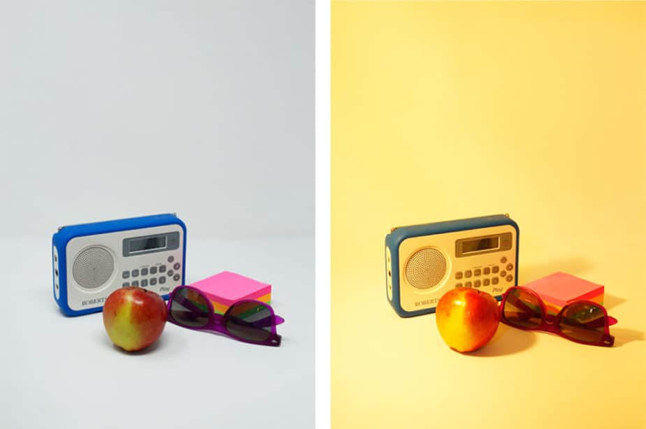
How do You Take Photos in a LightBox, AmazonBasics Studio?
The histogram could help you check for clipping in this bright, white, mini studio lightbox. Check out our illustrated guide right here in Photography Skool.