These two tools are very useful to inject life into a dull photograph but they work in very different ways. One of them applies an unrestrained, broad-brush colour enhancement to all of the hues in an image. The other one is much smarter and assigns priority to give the dullest colours more intensity without destroying detail. Here’s a concise description of the difference between the two functions:
Saturation controls the intensity of all the colours indiscriminately except pure white, pure black and desaturated greys. It is an unrestrained action and can lead to clipping. Vibrance is more controlled and enhances the subdued colours, it also affects skin tones to a far lesser degree.

Detailed Explanation of Saturation And Vibrance in Photo Editing
In these examples we will use images edited in Photoshop as this has the possibility of very extreme results and more than one way to apply Colour control to images.
What is The Effect of Saturation on Colours In Photo Editing?
The image below is a comparison pair between the original unedited image and an image that has been put through the Hue/Saturation tool at +100. (You can use the slider to swipe between the two outcomes for easy comparison). You can find this Saturation tool in the “Image” tab, thus:
- Image
- Adjustments
- Hue/Saturation
- Saturation
You can also achieve the same results with less destructive effect by adding an Adjustment Layer and choosing “Hue/Saturation” from the list of options.


As you can see, this is the bluntest of tools when pushed to the extremes of +100 (the maximum assignable value). All of the colour hues get pushed up in intensity despite the starting point of their saturation. Some saturated colours will therefore get pushed to the point of clipping and lose detail.
Impure composite colours become fractured into ugly, giant pixelations that resemble extreme noise/grain. Posterization can occur causing undesirable banding as the smooth transitions split into basic colour steps.
The effect on skin tone at +100 is catastrophic. It becomes extremely unnatural looking as all the pigment colours are pumped up to a shocking day-glow orange/yellow and any red tones in the skin are exaggerated to a painful-looking scarlet shade.
Of course, this is a very extreme example to emphasise the unforgiving nature of the Hue/Saturation tool on colours when pushed too far.
Please note that in my example photos, pure blacks and whites are unchanged even when the slider is pushed to +100 (or -100). Also, the pure desaturated grey tones remain unchanged, which is interesting to know. If the greys are made up of multiple different coloured pixels then the saturation could be affected when you push the Hue/Saturation slider around.
What is The Effect of Vibrance on Colours In Photo Editing?
Below, you will see an interactive sliding comparison image with an original image on the left side and a processed image on the right that has had a Vibrance level of +100 applied to it.
As with Saturation, the Vibrance tool can be found under the “Image-Adjustments” tab or by adding an “Adjustment Layer”.


This time the effect on the saturation/intensity of the colours is much more restrained and controlled; even at +100 on the slider. It’s a much more civilised tool but still provides a little punch to the colours. It’s like a fine veil of dust has been wiped clean from the surfaces of the colours to reveal their true quality and help them to pop.
In such a restrained environment it is impossible to push any colours to the point of clipping. The Vibrance slider has little effect on fully saturated colours and actually focuses on pulling up the more muted colours towards the saturated levels to create a better balance of colour intensity.
This time the effect on skin tone is very minimal. They remain quite natural looking even at the +100 level. They are not unchanged but maintain an acceptably, realistic colour/tone.
The overall effect is quite subtle but pleasing. It is easy to be heavy-handed with the Saturation tool so perhaps, using the Vibrance tool would impose some prudent restraint on your photo editing.
What Are The Three Ways to Adjust Colour Saturation In PhotoShop?
There are actually three different ways to directly adjust the intensities of colours in Photoshop. They become increasingly unsophisticated and primitive. We will examine them each in detail using a palette of pure colours to observe the changes in a controlled manner.
Vibrance Slider in The Vibrance Tool
The first and most subtle is the Vibrance Slider found in the Vibrance tool. It can be found in the following drop-down tab sequence:
- Image
- Adjustments
- Vibrance
- Vibrance Slider
Or just create an “Adjustment Layer” for “Vibrance” in the Layers Panel.


You will notice that while swiping the slider from left to right, the top row of saturated rainbow colours doesn’t change at all as they are already quite saturated. The rows of progressively desaturated colours below them are given a subtle boost but nothing too excessive.
Only the darker of the skin tones receive a noticeable boost but even that is an acceptable tone. It is fair to conclude that the reds, oranges and yellows get a slightly bigger boost than the blues and purples appear to.
The white, black and desaturated greys appear to remain unchanged.
Saturation Slider in The Vibrance Tool
The second option is also found within the Vibrance tool and it is the second slider found under these drop-down tabs:
- Image
- Adjustments
- Vibrance
- Saturation Slider


This time, the top row of Primary colours Red, Yellow and Blue remain unchanged as you swipe the slider left and right. The top row Green also appears to remain unchanged, probably as it part of the pure Colour Space of RGB, so it is a root colour used to make other colours.
The top-row secondary colours of Orange, Purple and Violet have received a noticeable boost of saturation. This is probably because they aren’t pure colours and are made up of usually, two colours mixed together. This leaves a little latitude for further saturation/intensity.
In the case of the skin tones, they have all received a pronounced boost that may make them appear unacceptably unnatural in photographs featuring people.
As with the Vibrance Slider previously, the pure white, black and desaturated greys don’t receive any boost as they contain no colour hues whatsoever.
Saturation Slider in The Hue/Saturation Tool
The third way to adjust Colour Saturation in Photshop is a slider found in the following tab sequence:
- Image
- Adjustments
- Hue/Saturation
- Saturation
It is the most unforgiving of the three options. The top-row of saturated colours is largely unaffected even at +100 on the saturation slider. Only the violet hue gets a slight boost.


All the reds appear to get the largest boost up to near maximum saturation despite their starting point. The other two primary colours, Blue and Yellow don’t appear to receive much of a lift across the whole range.
The secondary colours of Orange and Green receive a significant uplift across the whole range of saturations but not quite as strong as the Reds. the darker purples get a hint of added richness and all of the Violets get increasingly intense as you look down the range.
The skin tones all take on a marked orange tint after application of this form of saturation. This would probably look unappealing and unnatural in photographs containing people, even if applied minimally.
As in the other two options, Black, White and pure greys are unnaffected.
Summary of Comparison of The Three Saturation Techniques
Obviously, these are very extreme examples to help highlight the limitations and finesse of the different tools. With all of them, it will be necessary to apply them with some restraint and judgement, to different degrees, so the colours don’t become overblown and gaudy.
With the Vibrance Slider, it is much easier to curb your enthusiasm as this tool will not allow you to take the colours too far beyond acceptability. With the other two saturation tools, you will have to work to maintain some discipline over the movement of the sliders and keep referring back to the original for reference by unchecking the “Preview” box.
How Do Saturation And Vibrance Affect Skin Tones in Photo Editing?
This is an important consideration for a lot of photographers who like to include people in their compositions. The main goal is to produce an image with natural looking skin tones.
So, let’s take a detailed look at how the three Saturation tools handle skin tones.
This first example is the “Vibrance Slider” in the “Vibrance” tool.


It’s clear to see that it does a pretty good job of preserving the integrity of the skin tones. This example is pushed all the way to +100 so you can see that if you apply a more restrained level of enhancement, the skin tones will be protected and look natural.
This tool could be used successfully to add a little warmth to the skin tones, a healthy glow to uplift a pallid, anaemic pallor if the composition supports that kind of mood lift.
Now, let’s take a look at the “Saturation Slider” in the “Vibrance” tool.


This is much more unforgiving on the outcome of skin tones. The skin takes on a mixture of unnatural looking orange and red tones. It also strongly boosts the other colours in the image so very quickly this photo could become overwhelmingly cartoonish.
It would be wise to exercise some caution when applying this tool to human portraits. Not to say that it should never be used, just to be careful and move the slider in small increments.
Finally we’ll examine the “Saturation Slider” in the “Hue/Saturation” tool.


This was the original tool for adjusting Saturation in PhotoShop and it was rather unsophisticated compared to the Vibrance tool which came later. When misused, it can be the most damaging to skin tones.
Taken to the extreme, like in our example above, the skin tones become horribly vivid, almost unrecognisable as human. The deep orange and red tones start to become posterised and clipped causing loss of detail. The subtlety of shading becomes lost and overall the image begins to resemble graphic Pop Art.
There probably is a place for this tool in photo editing but it’s probably not necessary to use it in human portraiture or crowd scenes.
When Should You Use Saturation or Vibrance in Photo Editing?
Certainly, if your scene contains people you should start out by trying to edit the colour intensity with the “Vibrance Slider” as this will protect the skin tones and not blow out the other colours.
If your skin tones in the original are very pale or desaturated you may be able to use the other “Saturation” tools to boost all the colours in the scene whilst not affecting the skin tones significantly.
When you shoot in RAW your images can look a little dull and flat overall as they have had no processing like a Jpeg has had, particularly if you shot in flat, overcast light. In this case, it may be appropriate to give the whole image a boost by using one of the Saturation tools. Use them judiciously though and hold back on pushing them too far. You could then go on to fine-tune the image with the “Vibrance Slider” which would add more subtle colour enhancement to the muted tones.


Let’s consider the mood of the photograph. If the scene was an upbeat, happy situation or a bright and colourful composition, it would be agreeable to push all of the colours slightly beyond the point of acceptability. This would help to convey the exaggerated mood of glee. This could easily be achieved by using the “Saturation” tools. Don’t be too heavy-handed though.
If however, the subject of the photograph is bleak or desolate it may be appropriate to use the “Vibrance Slider” and take it towards the negative side and actually drain some of the vibrancy out of the scene. This will better convey the idea of melancholy without reducing the image to complete grey-scale.


Photo by Oscar J Harper
If your photo is mostly colourful but just requires a little lift to bring balance to the composition you could employ the “Vibrance Slider” to bring up some of the more muted hues.
Related Questions
What is White Balance in Digital Photography?
Before you even attempt to enhance the colours with the Saturation and Vibrance sliders it is probably worthwhile to check the overall White Balance of the image. This can affect the cast of all the colours but it is easily corrected using the methods described in our illustrated guide that you can find right here on Photography Skool. The application of White Balance will take all the colours to a more natural-looking starting point.
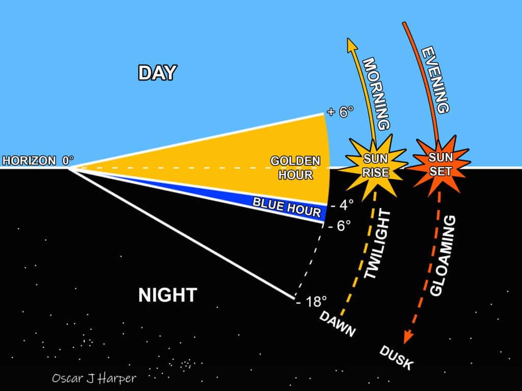
What is The Golden Hour in Photography?
This is a magical part of the day and is visible twice in 24 hours, weather permitting. The golden, orange and red colours that you will observe are naturally saturated but may require a little more manipulation. You can read more about this stunning time of day by clicking here on Photography Skool to go to our illustrated article.
What is The Blue Hour in Photography?
This is the most ephemeral of opportunities in photography. It’s tricky to capture and the true blue hour usually lasts only minutes not hours. For your perseverance, you will be rewarded with a range of rich, saturated blue hues. If you wish to learn more about this enchanting and mysterious light, click here to view our illustrated feature on Photography Skool.
How do You Take Stunning HDR Photographs?
You can push the tonal range and increase the intensity and range of color hues by employing the technique of HDR (High Dynamic Range) photography. It involves merging multiple pictures taken at different exposures to produce an improved overall image and you can read more about this useful technique right here in Photography Skool.